Ivar Blaauw presents
Brand guides
identity of a brand is where it starts
Brand guides exist because without them, a brand falls apart fast. If your logo, colors, and typography shift every time they’re used, the brand stops feeling like a brand. A guide locks down the rules so every piece of content looks unified, no matter who makes it. You don’t want to rethink colors, fonts, spacing, or logo placement for every project.
Here’s the blunt truth:
- Consistency is everything
- They save time
- They protect the brand
- They make teams scalable
- They strengthen recognition
A brand guide removes guesswork. People grab the rules and get straight to creating. Without guidelines, quality slips. Bad resizing, wrong colors, stretched logos—small mistakes that make the brand look cheap. A guide prevents that. Freelancers, new hires, partners; everyone can produce on-brand work instantly. No hand-holding. The more consistent the visuals, the faster people associate them with your brand. Recognition is built by repetition, not randomness.
Below you’ll find the Brandguides I have created or have been a part of throughout the years. From successful businesses like UNii Security and ILGM.com, as well as small projects such as Geek-Dating. With over 10 years on the job, I know how to create brand guidelines, and make sure your front and back end developers know what to do!
SteFit
A strong, premium identity for a personal trainer in Leusden.
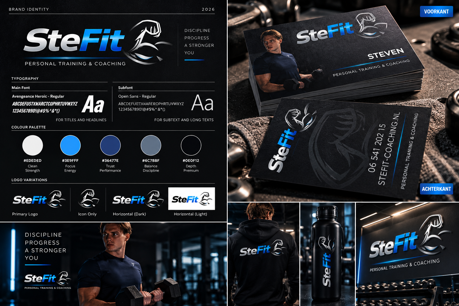
- Typeface Avengeance Heroic for titles, Open Sans for text
- Palette Electric blue, navy, steel grey and near-black
- Applied to Business cards, hoodie, water bottle, gym sign and social visuals
- Character Disciplined, powerful, premium
A strong, premium identity for SteFit, personal training and coaching in Leusden. The chrome-and-blue wordmark and flexed-arm mark carry the brand’s promise of discipline, progress and a stronger you. Bold Avengeance Heroic headlines sit on clean Open Sans text, and the dark palette with electric-blue accents runs from business cards to the hoodie, water bottle and a glowing gym sign.
Stuc Design Apeldoorn
A refined identity for a plastering company that sells craftsmanship.
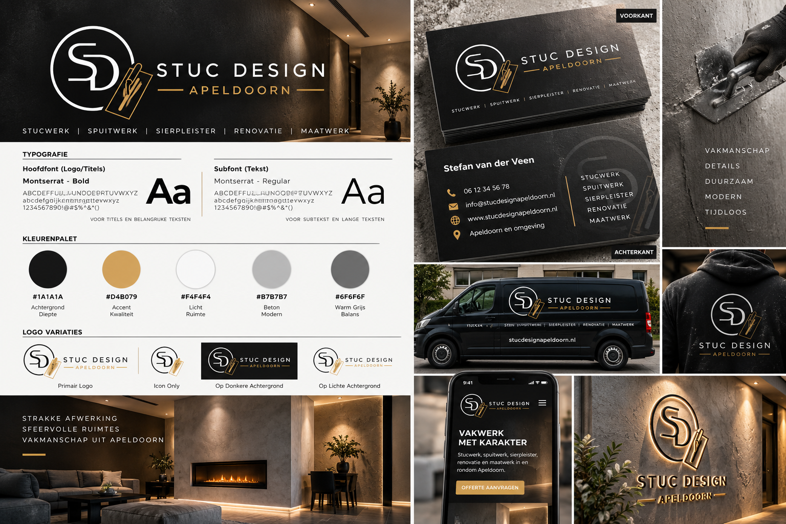
- Typeface Montserrat Bold and Regular
- Palette Black, gold and concrete greys
- Applied to Business cards, van, workwear, mobile website and wall sign
- Character Crafted, calm, timeless
A refined identity for Stuc Design Apeldoorn, a plastering company that sells craftsmanship as much as walls. The SD monogram with its golden trowel, Montserrat typography and a palette of black, gold and concrete greys give the brand a calm, high-end feel. It carries through on business cards, the company van, workwear, the mobile website and a backlit wall sign.
Nether Lion Studios
A game-ready identity built around a bold geometric lion.
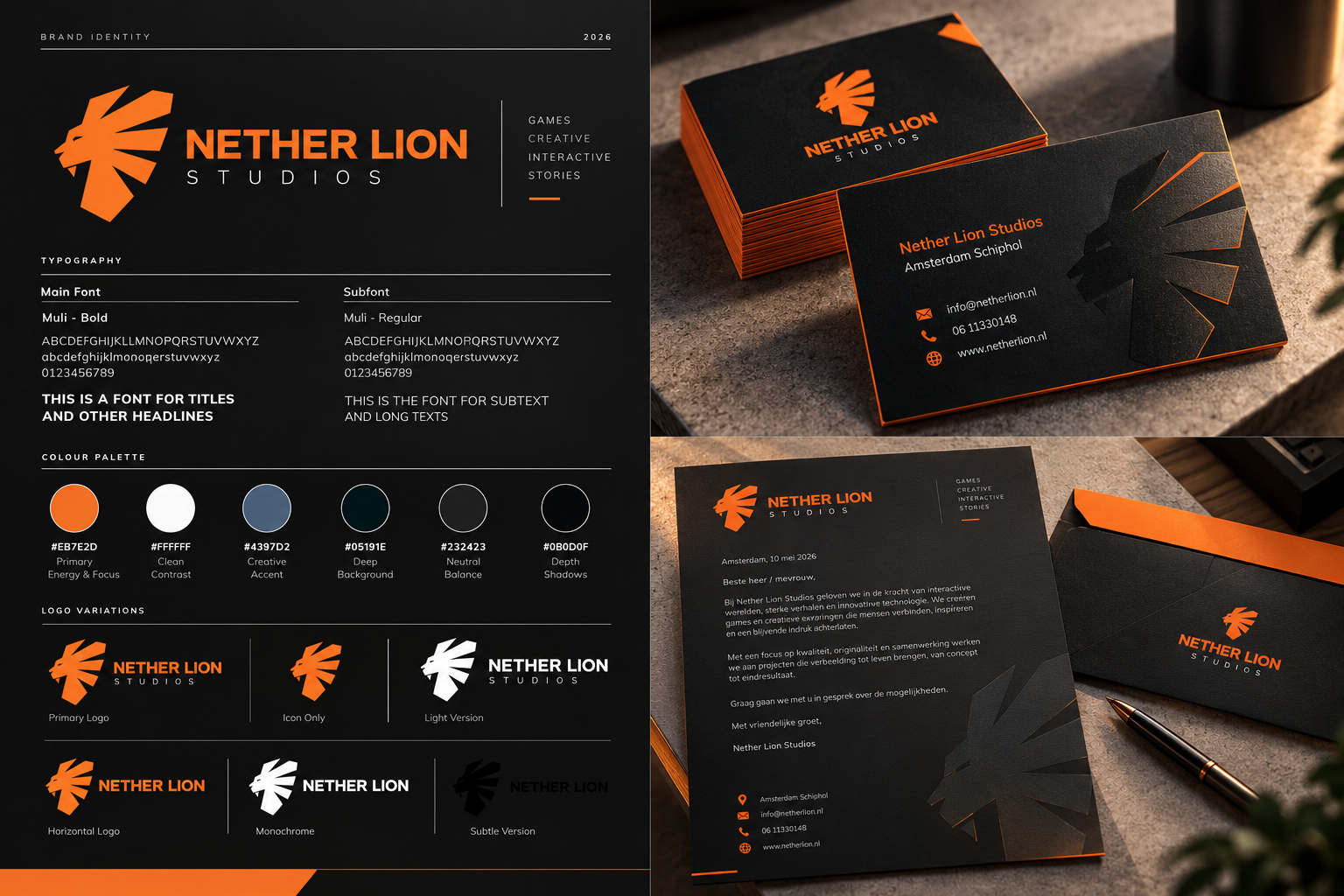
- Typeface Muli
- Palette Vibrant orange, deep blues and neutrals
- Applied to Logo variations, business cards, letterhead and envelope
- Logo Sven van Asselt
- Character Contrast-based, minimalistic, Dutch orange
A striking, game-ready identity for Nether Lion Studios, built around a bold geometric lion mark, vibrant orange accents, and clean Muli typography. The palette blends energetic warm tones with deep blues and neutrals, giving the brand a heroic, adventurous feel. Shown across business cards and letterheads, the system keeps layouts sharp and modern, perfect for a studio focused on strong visual worlds and memorable storytelling.
UNii Security
A bold, modern identity for a contemporary security company.
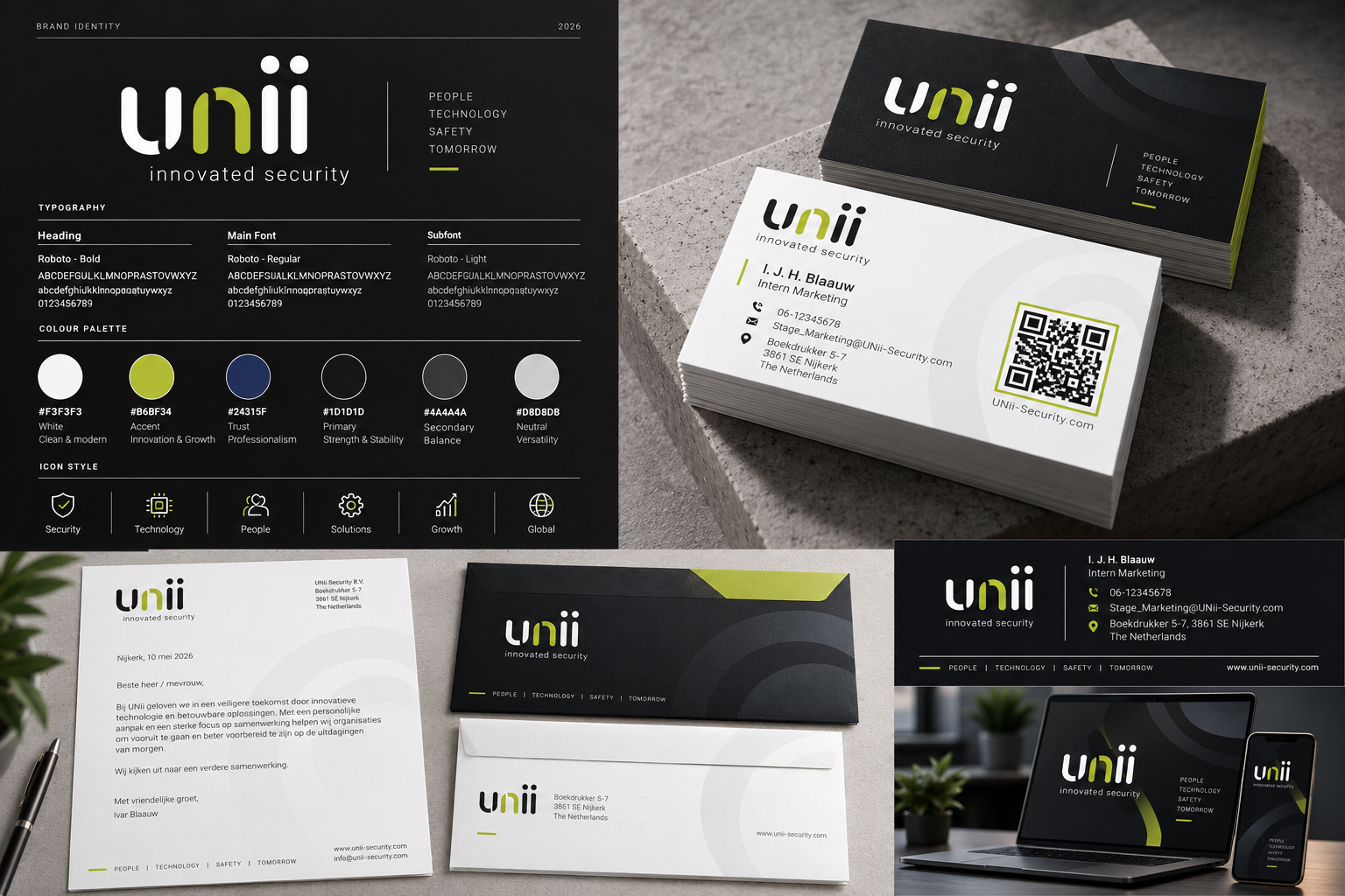
- Typeface Roboto Bold, Regular and Light
- Palette Lime, navy and neutrals
- Applied to Business cards, letterhead, envelopes, email signature and screens
- Character Professional, contrast-based, minimalistic
A bold, modern identity for UNii, built around a rounded wordmark, Roboto typography, and a tight palette of lime, navy, and neutrals. The brand is applied consistently across business cards and stationery, highlighting clear hierarchy, strong contrast, and a clean, tech-driven look that fits a contemporary security company.
ScreenArts
A crisp, high-contrast identity with a film-strip logotype.
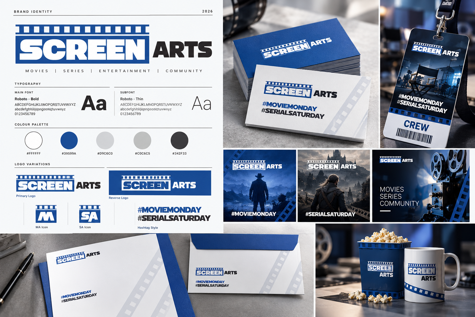
- Typeface Roboto, heavy and thin
- Palette Blue and white
- Logo Original by Michael Braam, AivionStudios
- Character Professional, contrast-based, two colours
- Applied to Business cards, crew pass, stationery, social posts and merchandise
A crisp, high-contrast identity for Screen Arts, built around a bold film-strip logotype and a tight blue-and-white palette. Using Roboto in heavy and thin weights, the system keeps titles punchy while letting supporting text stay clean and minimal. The various sublogos follow the same visual rhythm, giving the brand a consistent, professional feel that adapts easily across formats; from hashtags to icon-style marks.
MyCreed Network
A sharp identity in the visual language of Assassin’s Creed.
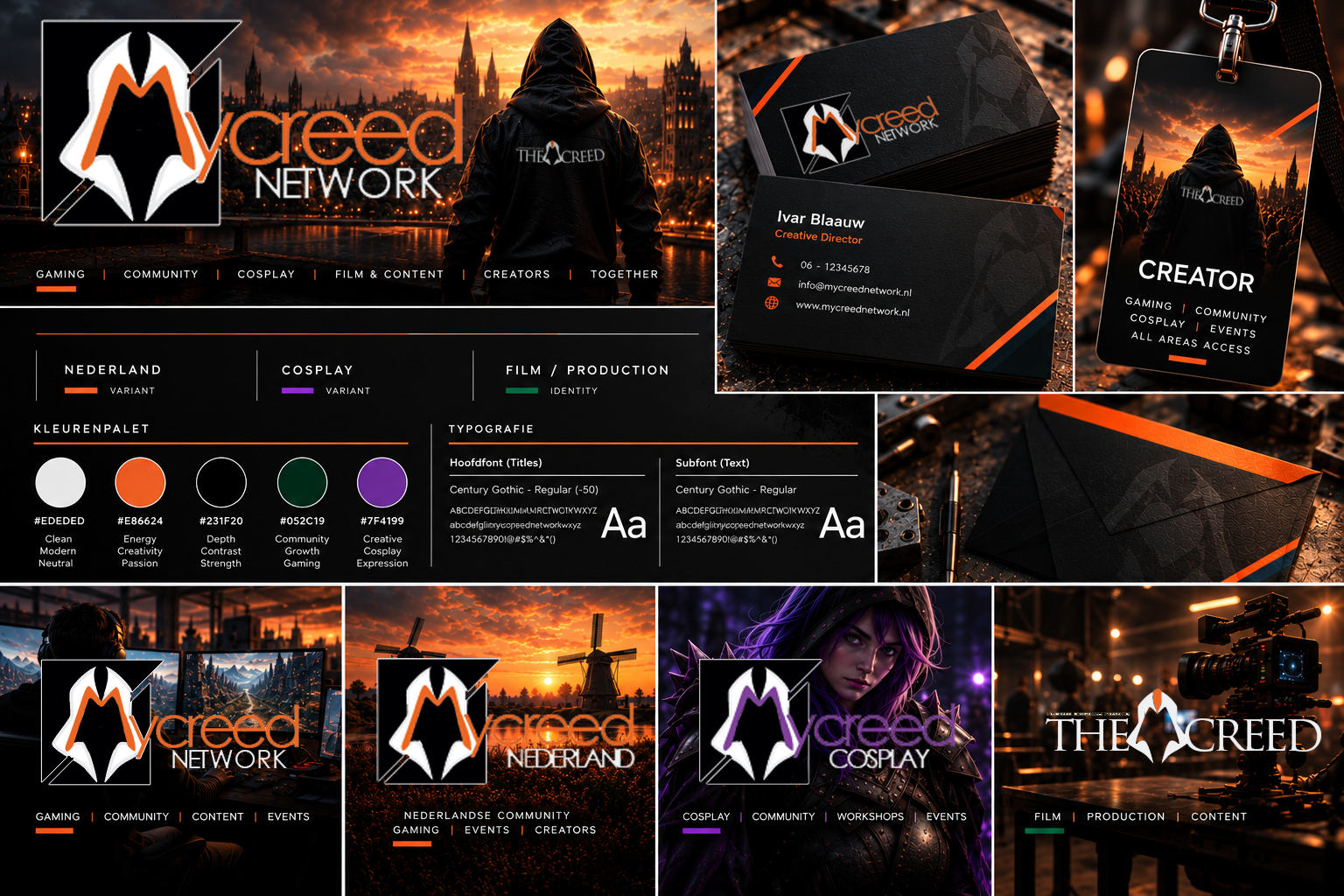
- Typeface Century Gothic
- Palette Orange, black, green and purple
- Logo Original by Michael Braam, AivionStudios
- Inspired by Assassin’s Creed
- Applied to Sub-brands, business cards, creator pass, letterhead, envelope and channel banners
A sharp, contrast-driven identity for MyCreed Network, inspired by the visual language of Assassin’s Creed while keeping a clean, professional edge. The refined logo, paired with Century Gothic and a focused palette of orange, black, green, and purple, creates a system that feels bold yet controlled. Sub-brands slot in seamlessly, maintaining consistency while giving each branch its own presence; resulting in a streamlined, modernized take on the original concept.
Beyond the Horizons
A calm, explorative identity that runs from peach to deep crimson.
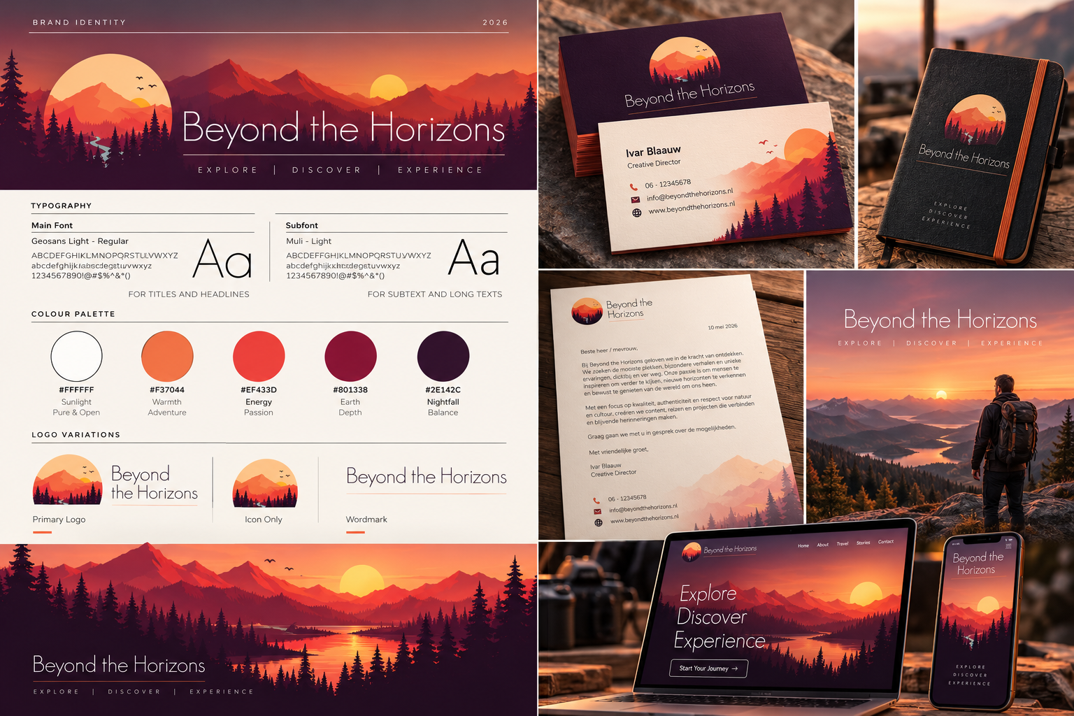
- Typeface Geosans Light, with Muli for longer text
- Palette Peach to deep crimson
- Inspired by No Man’s Sky and Firewatch
- Character Minimalistic, with a unique art style
- Applied to Business cards, notebook, letterhead and website
Created as part of my work for Beyond the Horizons, the client asked for a design which was similar to minimalistic popular games such as No Mans Sky and Firewatch. The palette moves from peach to deep crimson, echoing the illustrated landscape and giving the brand a calm, explorative character. Paired with clean Muli for longer text, the system balances artistry with readability—perfect for a project rooted in discovery, storytelling, and visual immersion.
Geek Dating
A playful identity for a light-hearted matchmaking concept.
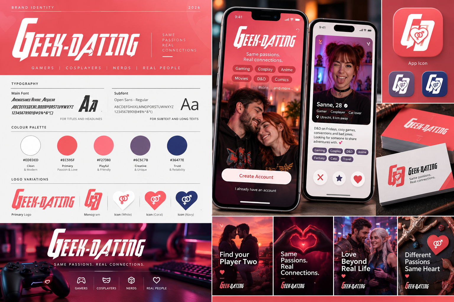
- Type Avengeance Heroic for titles, Open Sans for text
- Palette Soft pinks to deep blues
- Character Romantic yet geeky, minimalistic
- Applied to App screens, app icons, business cards and social posts
A playful, stylized identity for Geek-Dating, mixing romantic cues with bold, comic-inspired typography. The palette ranges from soft pinks to deep blues, giving the brand plenty of flexibility while keeping the vibe fun and unmistakably geeky. Clean iconography and minimalistic layouts tie it all together, creating a look that’s energetic, approachable, and perfect for a light-hearted matchmaking concept.
Credits
- Identities SteFit, Stuc Design Apeldoorn, Nether Lion Studios, UNii Security, ScreenArts, MyCreed Network, Beyond the Horizons, Geek Dating
- Typefaces Montserrat, Roboto, Muli, Century Gothic, Geosans Light, Avengeance Heroic, Open Sans
- Nether Lion logo Sven van Asselt
- ScreenArts and MyCreed logos Michael Braam, AivionStudios